Taking a Global Hemophilia Assessment From Paper to Tablet

Therapists worldwide score joint damage in hemophilia patients on a paper form, totalling it by hand. I led the design of the digital tool that replaces it: one interface that guides newer assessors without slowing down experts.

Client • Studio
SickKids • Pivot Design Group
Role
Design Lead
Scope
UI design, branding, high-fidelity prototyping, usability testing
Team
Two designers through research and wireframing; a tech lead on scoring logic
8 countries
Clinicians tested it across 4 continents, from Canada to Lebanon to Thailand
0 manual calculations
Scoring went from manual arithmetic to automatic
10/10
Therapists had enough flexibility in the tool to fit their workflow
The Problem
A global standard — still on paper.
The Hemophilia Joint Health Score (HJHS) is the global standard for tracking joint health in people with hemophilia. It lived on paper, so scores were calculated by hand and progress across visits was hard to follow.

01
Very different users
Assessors range from HJHS experts to physicians with no formal training, many working outside their first language.
02
A hands-full setting
Therapists assess hands-on, juggling a goniometer, the patient's exercises and often a young child.
03
No patient data storage
Privacy laws vary by country, so the tool couldn't save records, yet therapists still needed to track progress over time.
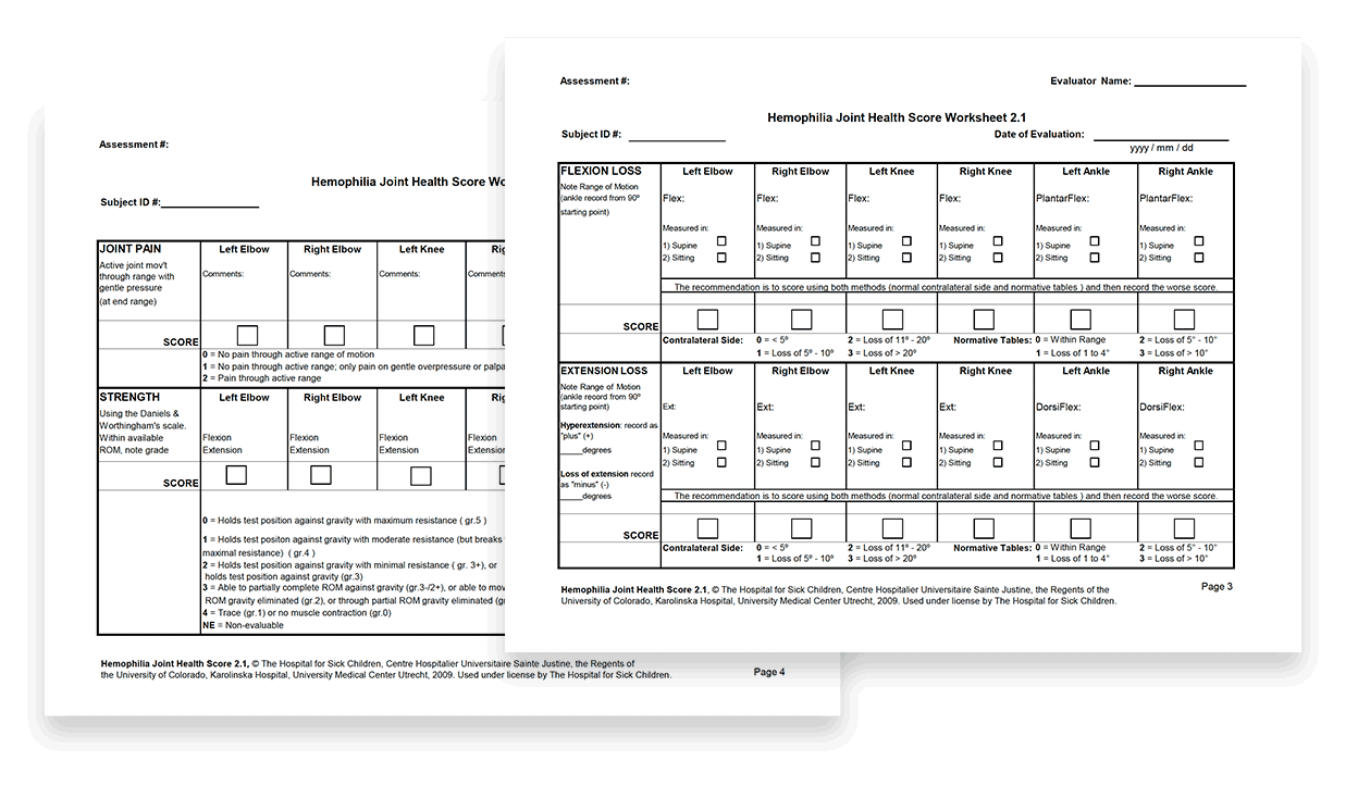
The original paper tool
The Solution
How it came together
01
Starting with the people, not the form
During assessments, a therapist might be holding a goniometer, a clipboard with the paper tool, coaching a patient through exercises and answering a parent's questions, all at once.
We worked with the client to better understand three key personas. The most telling was the busy clinical physiotherapist who skips items without realizing it skews the score. This established a central challenge: help the least experienced user’s accuracy without slowing down the expert.
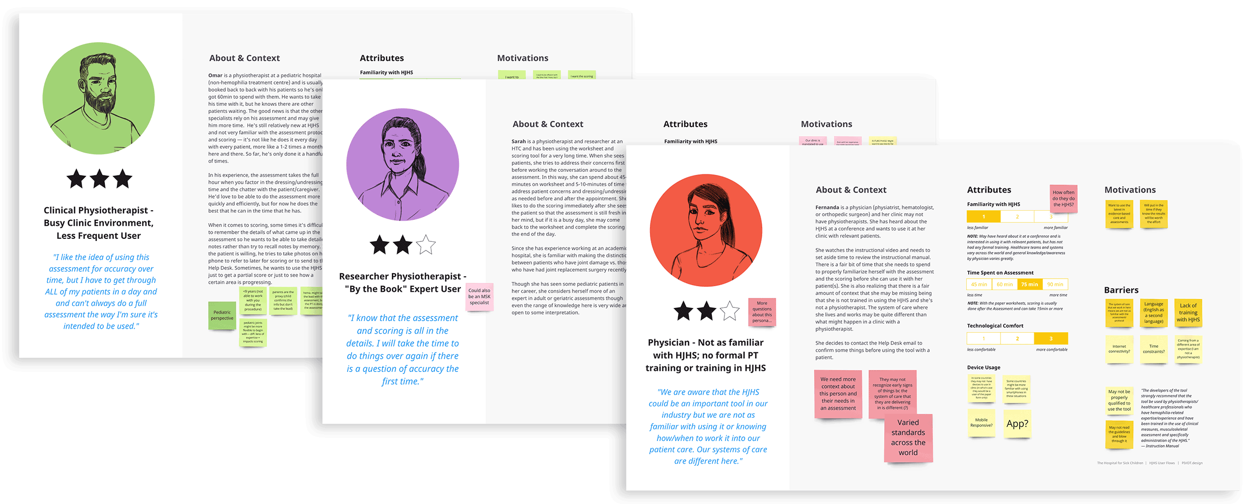
Personas developed iteratively with the client & SMEs
02
One tool, two ways of working
Our expert persona needed to work in her own order, while newer assessors needed a clear path. Instead of one rigid flow, the tool offers two equal routes, Assess by Item and Assess by Joint. Therapists can switch between them at any time without losing progress.
Guidance sits one tap away in information drawers and prompts: there for those who need it, easy to skip for those who don't. A review screen closes the loop. It flags missed entries before a session ends and lets therapists mark items they left out on purpose.
Review Score: missed entries flagged before the session ends
03
Turning a constraint into a workflow
Privacy laws vary so much by country that the tool couldn't store patient data. That put a core goal, tracking progress over time, at risk. Rather than drop it, we made the data portable.
Therapists download each session as a PDF or CSV, then upload it next time to bring previous scores forward.
Welcome screen: the start of every session
04
Giving the tool its own identity
When I took over as Design Lead, the tool had no brand, only an acronym. I explored two visual directions with different levels of SickKids branding. Because many therapists worldwide don't know SickKids, I recommended a standalone identity. I built it from the HJHS acronym and a concentric-circle motif representing the swelling and pulsing pain of joint bleeds.
I carried that motif into the body diagram, which mirrors the patient facing the therapist, updates scores live and doubles as navigation. I kept the figure gender-neutral, youthful and racially neutral so it represents every patient.
The logotype, and the body diagram updating as joints are scored
05
Testing it with the world
I built the prototype flows and led ten remote sessions with clinicians in eight countries. They challenged one of our assumptions. In clinics without electronic medical records, data storage wasn't a concern, which confirmed the download approach for this phase. I turned the findings into an actionable list of refinements and future-phase recommendations, and presented them to the Oversight Committee.
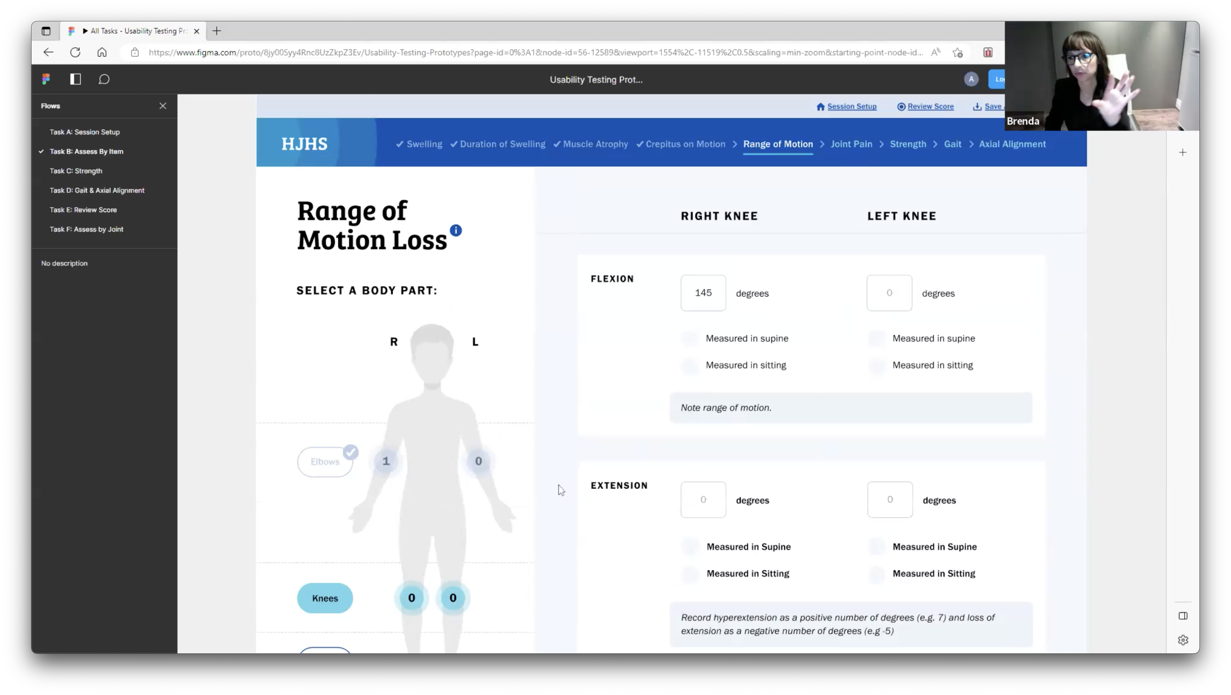
A remote usability session on the prototype
Impact
Approved, built and heading worldwide
Tested with ten clinicians in the Netherlands, USA, Canada, Thailand, Lebanon, Brazil, Italy and the UK.
Oversight Committee approved testing recommendations, which shaped the build. Development is complete, and the tool is moving to global rollout in early 2027.
Usability Testing Therapists’ Responses
“For someone who uses it many times — with many patients and in the right way to follow patients — it is absolutely a useful tool.”
“That's just how my brain works, so to have that option is huge!”
“The hints and options to click on for information are useful. I like the way it’s presented.”
about me
Resumé
I’d love to hear from you!


© 2026 Brenda LittleMade with ❤️ in Canada
Taking a Global Hemophilia Assessment From Paper to Tablet
Therapists worldwide score joint damage in hemophilia patients on a paper form, totalling it by hand. I led the design of the digital tool that replaces it: one interface that guides newer assessors without slowing down experts.

Client • Studio
SickKidsPivot Design Group
Role
Design Lead
Scope
UI design, branding, high-fidelity prototyping, usability testing
Team
Two designers + a tech lead on scoring logic
8 countries
Clinicians tested it across 4 continents, from Canada to Lebanon to Thailand
0 manual calculations
Scoring went from manual arithmetic to automatic
10/10
Therapists had enough flexibility in the tool to fit their workflow
The Problem
A global standard — still on paper.
The Hemophilia Joint Health Score (HJHS) is the global standard for tracking joint health in people with hemophilia. It lived on paper, so scores were calculated by hand and progress across visits was hard to follow.

01
Very different users
Assessors range from HJHS experts to physicians with no formal training, many working outside their first language.
02
A hands-full setting
Therapists assess hands-on, juggling a goniometer, the patient's exercises and often a young child.
03
No patient data storage
Privacy laws vary by country, so the tool couldn't save records, yet therapists still needed to track progress over time.
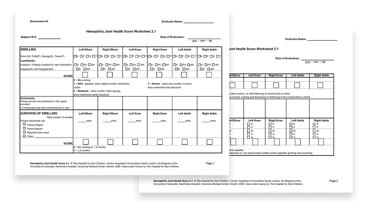
The original paper tool
The Solution
How it came together
01
Starting with the people, not the form
During assessments, a therapist might be holding a goniometer, a clipboard with the paper tool, coaching a patient through exercises and answering a parent's questions, all at once.
We worked with the client to better understand three key personas. The most telling was the busy clinical physiotherapist who skips items without realizing it skews the score. This established a central challenge: help the least experienced user’s accuracy without slowing down the expert.
Personas developed iteratively with the client & SMEs
02
One tool, two ways of working
Our expert persona needed to work in her own order, while newer assessors needed a clear path. Instead of one rigid flow, the tool offers two equal routes, Assess by Item and Assess by Joint. Therapists can switch between them at any time without losing progress.
Guidance sits one tap away in information drawers and prompts: there for those who need it, easy to skip for those who don't. A review screen closes the loop. It flags missed entries before a session ends and lets therapists mark items they left out on purpose.
Review Score: missed entries flagged before the session ends
03
Turning a constraint into a workflow
Privacy laws vary so much by country that the tool couldn't store patient data. That put a core goal, tracking progress over time, at risk. Rather than drop it, we made the data portable.
Therapists download each session as a PDF or CSV, then upload it next time to bring previous scores forward.
Welcome screen: the start of every session
04
Giving the tool its own identity
When I took over as Design Lead, the tool had no brand, only an acronym. I explored two visual directions with different levels of SickKids branding. Because many therapists worldwide don't know SickKids, I recommended a standalone identity. I built it from the HJHS acronym and a concentric-circle motif representing the swelling and pulsing pain of joint bleeds.
I carried that motif into the body diagram, which mirrors the patient facing the therapist, updates scores live and doubles as navigation. I kept the figure gender-neutral, youthful and racially neutral so it represents every patient.
The logotype, and the body diagram updating as joints are scored
05
Testing it with the world
I built the prototype flows and led ten remote sessions with clinicians in eight countries. They challenged one of our assumptions. In clinics without electronic medical records, data storage wasn't a concern, which confirmed the download approach for this phase. I turned the findings into an actionable list of refinements and future-phase recommendations, and presented them to the Oversight Committee.
A remote usability session on the prototype
Impact
Approved, built and heading worldwide
Tested with ten clinicians in the Netherlands, USA, Canada, Thailand, Lebanon, Brazil, Italy and the UK.
Oversight Committee approved testing recommendations, which shaped the build. Development is complete, and the tool is moving to global rollout in early 2027.
Usability Testing Therapists’ Responses
“For someone who uses it many times — with many patients and in the right way to follow patients — it is absolutely a useful tool.”
“That's just how my brain works, so to have that option is huge!”
“The hints and options to click on for information are useful. I like the way it’s presented.”
about me
Resumé
I’d love to hear from you! Get in touch at


© 2026 Brenda Little | Made with ❤️ in Canada
Taking a Global Hemophilia Assessment From Paper to Tablet
Therapists worldwide score joint damage in hemophilia patients on a paper form, totalling it by hand. I led the design of the digital tool that replaces it: one interface that guides newer assessors without slowing down experts.

Client • Studio
SickKids • Pivot Design Group
Role
Design Lead
Scope
UI design, branding, high-fidelity prototyping, usability testing
Team
Two designers through research and wireframing; a tech lead on scoring logic
8 countries
Clinicians tested it across 4 continents, from Canada to Lebanon to Thailand
0 manual calculations
Scoring went from manual arithmetic to automatic
10/10
Therapists had enough flexibility in the tool to fit their workflow
The Problem
A global standard — still on paper.
The Hemophilia Joint Health Score (HJHS) is the global standard for tracking joint health in people with hemophilia. It lived on paper, so scores were calculated by hand and progress across visits was hard to follow.

01
Very different users
Assessors range from HJHS experts to physicians with no formal training, many working outside their first language.
02
A hands-full setting
Therapists assess hands-on, juggling a goniometer, the patient's exercises and often a young child.
03
No patient data storage
Privacy laws vary by country, so the tool couldn't save records, yet therapists still needed to track progress over time.
The original paper tool
The Solution
How it came together
01
Starting with the people, not the form
During assessments, a therapist might be holding a goniometer, a clipboard with the paper tool, coaching a patient through exercises and answering a parent's questions, all at once.
We worked with the client to better understand three key personas. The most telling was the busy clinical physiotherapist who skips items without realizing it skews the score. This established a central challenge: help the least experienced user’s accuracy without slowing down the expert.
Personas developed iteratively with the client & SMEs
Review Score: missed entries flagged before the session ends
02
One tool, two ways of working
Our expert persona needed to work in her own order, while newer assessors needed a clear path. Instead of one rigid flow, the tool offers two equal routes, Assess by Item and Assess by Joint. Therapists can switch between them at any time without losing progress.
Guidance sits one tap away in information drawers and prompts: there for those who need it, easy to skip for those who don't. A review screen closes the loop. It flags missed entries before a session ends and lets therapists mark items they left out on purpose.
03
Turning a constraint into a workflow
Privacy laws vary so much by country that the tool couldn't store patient data. That put a core goal, tracking progress over time, at risk. Rather than drop it, we made the data portable.
Therapists download each session as a PDF or CSV, then upload it next time to bring previous scores forward.
Welcome screen: the start of every session
The logotype, and the body diagram updating as joints are scored
04
Giving the tool its own identity
When I took over as Design Lead, the tool had no brand, only an acronym. I explored two visual directions with different levels of SickKids branding. Because many therapists worldwide don't know SickKids, I recommended a standalone identity. I built it from the HJHS acronym and a concentric-circle motif representing the swelling and pulsing pain of joint bleeds.
I carried that motif into the body diagram, which mirrors the patient facing the therapist, updates scores live and doubles as navigation. I kept the figure gender-neutral, youthful and racially neutral so it represents every patient.
05
Testing it with the world
I built the prototype flows and led ten remote sessions with clinicians in eight countries. They challenged one of our assumptions. In clinics without electronic medical records, data storage wasn't a concern, which confirmed the download approach for this phase. I turned the findings into an actionable list of refinements and future-phase recommendations, and presented them to the Oversight Committee.
A remote usability session on the prototype
Impact
Approved, built and heading worldwide
Tested with ten clinicians in the Netherlands, USA, Canada, Thailand, Lebanon, Brazil, Italy and the UK.
Oversight Committee approved testing recommendations, which shaped the build. Development is complete, and the tool is moving to global rollout in early 2027.
Usability Testing Therapists’ Responses
“For someone who uses it many times — with many patients and in the right way to follow patients — it is absolutely a useful tool.”
“That's just how my brain works, so to have that option is huge!”
“The hints and options to click on for information are useful. I like the way it’s presented.”
about me
Resumé
I’d love to hear from you! Get in touch at


© 2026 Brenda Little | Made with ❤️ in Canada